Disponible en Español Welcome to AI Chats! We’re fine-tuning an AI agent with eLearn’s vast archive, and ask for wisdom about eLearning today. We verify and provide sources for every claim by hand.
Accessibility, Equity and Universal Design for Learning
Hi! I want to start our chat by asking, what are your favorite examples of ‘help one person, benefit everyone’?
Interesting “Help one person, benefit everyone” accessibility examples include:
- Closed Captions: Originally intended for people with hearing impairments, video captions have proven to be very useful nowadays in situations like noisy environments, language learning, and engaging content creation.
- Text-to-speech software: Mostly used by people with visual impairments or reading difficulties, it became a revolutionary feature, kickstarting a home assistant market. Speech-to-text applications have shown increased learning performance and attention. They’re also widely used drivers, multitaskers, and language learners.
- Curb cuts: Designed for wheelchair users, wider paddings in pedestrian side corners or angles benefit people with strollers, bicycles, delivery carts, and travelers with luggage. “Curb cuts” has become the name of the phenomenon in which an accessibility innovation provides additional benefits that spread out to other groups.
These examples are a small glimpse of the universal benefits of designing for accessibility.
Let’s talk about Universal Design for Learning (UDL) for a moment. In UDL, the word ‘Universal’ can give a wrong idea about commonality of needs or single perspectives. Please help with the confusion. Is there really a Universal way to design learning?
“Universal” in UDL does not imply one solution fits all. UDL emphasizes flexibility and customization to address diverse learner needs. UDL provides a framework, not a rigid formula. Effective UDL implementation requires understanding learner variability and offering options.
Alright, paint a picture of a successful UDL process that accounts for unique situations in accessibility and equity.
A basic Universal Design for Learning (UDL) process would already keep those concerns into mind:
- Define clear learning goals, involving all targeted learners and making sure everyone understands what they are expected to learn.
- Identify potential barriers, considering diverse learner needs and potential obstacles.
- Provide multiple means of engagement, various ways to stimulate interest and motivation. Ideas involve gamification, real-world projects, multiple content formats to cover all identified cases.
- Offer multiple means of presentation and access to information and data. You can present information in multiple formats: visual, auditory, textual, hands-on.
- Provide multiple means of action, creation and expression, and allow students to demonstrate learning in various ways: written reports, presentations, multimedia projects.
- Incorporate ongoing assessment and feedback, monitor progress and be ready to adjust instruction based on student needs and feedback.
- Foster collaboration and community, adding a supportive layer to the learning environment. Encourage peer interaction and support.
This UDL process ensures inclusive, accessible learning experiences for all students.
How does UDL compare to other models of learning being used today?
In general terms, two types of models are used to understand usability. On a broader, social level we have:
- Medical Model: Defines disability as a personal problem requiring medical intervention. Focuses on limitations and ways to fix them. It is based on long-standing traditions, many of which are considered obsolete and not always supported by scientific evidence.
- Social Model: Frames disability as a result of societal barriers, with a range of actors seen as responsible. It emphasizes inclusion and adaptation of environment.
As for educators, UDL is likely to be the most common but it is not the only one.
- UDL: Designs environments who will be usable by people with a wide range of abilities and disabilities. It offers a proactive approach with wide-reaching benefits.
- User-Centered Design: Focuses on the needs and experiences of the intended users, including those with disabilities. It is meant to involve users throughout the design process, and focuses on providing alternatives that cater them all.
So UDL appears to be common and also a comprehensive approach for learning design, although it might take a longer process than User-Centered approaches.
What are some of the latest breakthroughs in Accessibility you know of, developed using UDL and that have a high change to transform learning experiences for years to come?
- AI-powered personalization: Tailors learning experiences based on individual needs. These tools can adapt content, pace, and support to cater for diverse learners.
- Immersive technologies: Virtual and Augmented reality experiences can create engaging and accessible learning environments. If designed through UDL, multi-sensory experiences and simulations would expand the reach of the experience, not limit it. You can already see this in examples involving old populations who find in XR a way to expand their capabilities.
- Modern UDL frameworks: Stemming from UDL’s holistic approach, they provide guidelines and tools for creating flexible learning environments with modern tools and practices. By catering to different audiences, accounting for neurodiversity, and incorporating qualitative research methods, they ensure better inclusivity and personalized learning paths.
I expect these advancements to have long-term potential and make learning more equitable and accessible for all.
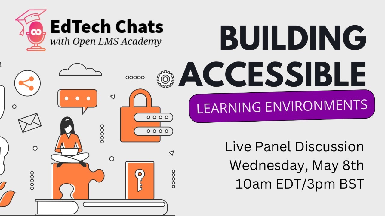
Building Accessible Learning Environments — EdTech Chats Transcript
Amy Tessitore: Good morning, everyone! I’m so excited to have Michael Vaughan and Gavin Henrick on our EdTech chat this month. May is Global Accessibility Awareness Day, and we’re all passionate about making learning accessible for everyone.
Amy: Gavin is the CEO and co-founder of Brookfield Education Labs, which provides an accessibility platform for Moodle. He has over 20 years of experience helping organizations implement educational technology, including Moodle. After working for Moodle HQ for over three years, Gavin co-founded Brookfield Education Labs to inspire organizations to ensure their learning is accessible for all learners. Brookfield is a remote-first company with staff across Ireland, Canada, and Spain. I met Gavin years ago through a Moodle accessibility working group he led, where we discussed how to make everything we do more accessible.
Amy: Michael is an academic technologist at Appalachian State University. He has over 15 years of experience in educational technology. He previously worked at Open LMS as an adoption and education specialist, helping LMS administrators and instructional designers optimize learning through their LMS. Michael is a renowned content creator with over 1.1 million followers across his platforms. He shares his tech expertise with digital communication to reach a global audience. His diverse contributions to the field of education include speaking engagements, training sessions, serving on the board of the realize Grant at Radford University, and co-founding Elon University’s first makerspace. Welcome to both of you!
Amy: This month, we’re focusing on accessibility and inclusivity. I think there are some preconceived notions about what accessibility is. We often think of it as just providing transcripts for people who are hearing impaired or making sure screen readers work. But it’s so much more than that. Gavin, when we talk about accessibility, what does it really mean?
Gavin Henrick: I remember a student panel at a conference a few years ago. Students with disabilities said that accessibility is when everything just works and they’re not reminded of their disability. It’s about ensuring there are no barriers that prevent people from engaging in a peaceful and equitable way with learning and other students.
Amy: I agree. When I first started working in this space, the accessibility office was just one person – me. At the time, the accessible version of things was a student requesting a PDF. That doesn’t work. Accessibility means that when I access education or workplace training, there are no barriers. I don’t have to ask for special access, software, or accommodations. What’s there works, and it’s there. I don’t have to keep asking for assistance or feel like I’m being singled out. Michael, what are your thoughts?
Michael Vaughn: I have a great example to share later about accessibility done well. But first, I want to talk about a TV show called Grand Designs. It’s a really nice, chill watch. The show follows a designer named Kevin MacLeod who interviews couples who are self-building their own homes. He interviews them in January, they show him their dream house, and he asks how long it will take. They say, “We’ll be in by Christmas.” And he says, “What year?” Then they follow him throughout the build, and you finally get to see the completed thing.
Michael: In one episode, there was a gentleman who was paraplegic. He lost the use of his legs at 15 years old and went on to become a Paralympian. The entire episode is about his current home and how much of a struggle it is for him to get around and do basic things versus what he gains in the new home he’s building.
Michael: The host interviewed the man, Mark Butler, and his wife, Penny. Mark’s take on disability was that it’s only our environment that makes us disabled. If we’re in an environment where we can do everything and get everywhere, then the disability goes away. I think that echoes what Gavin said earlier. We often think about disability in terms of individuality, but it’s not so much about the condition as it is about the environment we all share and interact with. We can maintain and augment that environment to make it accessible for others.
Amy: You point out something really important. We have preconceived notions about what accessibility looks like. For example, I live in the northeast US where it snows in the winter. We have handicap accessible parking, which is closer to the building, but it’s not covered parking. My local community college is on a hill, so when it snows, you can’t get to your car. There’s no covered walkway, so you have to wait for someone to shovel the snow. If you’re taking evening classes, you’re less likely to see the parking lot plowed at night. How are you navigating getting to your car in an area like this?
Amy: Accessible parking is all fine and good, but it doesn’t address the environmental barriers that make it difficult for people with disabilities to have equitable access.
Gavin: It would be interesting to have curb breaks in both cases, not just for people using wheelchairs, but also for people who can’t step up. The curbs in America are like, I don’t know, you expect everyone to be nine feet tall. People who struggle with steps, use a wheelchair, or are doing deliveries all face barriers. Having multiple curb breaks would make sense rather than just one.
Gavin: I think people don’t know what accessibility means because they don’t understand situational disability. They can understand and empathize when they can see it. But when they can’t see a disability or it only happens in certain circumstances, they don’t get it. For example, why is there a flashing light on a phone in a bar during the day? It doesn’t matter. You can hear the phone ringing. But when the place is packed and too loud to hear anything, that flashing light becomes useful.
Amy: That’s a great point. Research shows that physical impairments only represent 7% of all impairments and disabilities globally. We often focus on things that are observable, but 93% of impairments and disabilities are invisible. We often focus on wheelchair accessibility, but we don’t think about people with neurodiversity, which is often categorized as a disability. Some people see it as a superpower. There are things that are tough for people with ADHD, but they can do other things really well.
Amy: This is where we often go wrong with accessibility. We see examples of courses built with the idea that online courses are great for people with physical disabilities because they don’t have to leave their house. But then you go in and you’re blasted with music, there are colors all over the place, poor contrast, and a very busy course. That’s accessibility gone wrong.
Amy: I want to hear from both of you about times you’ve seen accessibility go wrong and times you’ve seen it done well.
Michael: I’ll start with an example of accessibility gone wrong. There was a disability rights advocate named Napoleon Malhotra who was invited to speak on a panel at a Smart Cities conference in India. The panel was about building cities of the future where everyone is involved and has access. Napoleon uses a wheelchair. He was invited to speak, but there was no ramp for him to get on stage. The organizers had to lift him in his chair, which is very intimate and uncomfortable for someone who uses a wheelchair.
Michael: I think this is a symptom of a larger problem. We try to address shortcomings with accessibility, inclusion, diversity, and equity by latching onto checkbox actions. These are small and simple things that are performative and don’t necessarily affect actual change. They make the person doing it look good, but they don’t actually change anything.
Michael: It’s like saying thanks for the land acknowledgments in your email signature. That doesn’t change policies that rob indigenous people of their children. It’s like putting pronouns next to your name. That doesn’t change the fact that trans people are having their very existence criminalized in several states. It’s nice to have these checkbox actions, but they don’t actually change anything.
Michael: If the organizers were truly engaged in activism, there would have been a ramp for Napoleon to get on stage.
Gavin: I’ve seen that so many times. Stages with no ramps, rickety steps. It’s interesting because the organizers might have had good intentions, but the practicality of running the event becomes different.
Gavin: I’ve seen people building content with good scripts, good videos, and captions. That’s great. But then they embed it in Moodle or another platform, and because there’s no tagging or full transcript, the global search won’t find it. They also might not provide a printable version or allow people to make the captions bigger.
Gavin: They’ve done something and think they’ve made their videos better because they have captions, but they’ve forgotten about all the other barriers. They’ve considered one thing, but not the rest. Even when they do captions, they don’t read them. They just do captions. They run a spell checker, but they don’t actually check the captions for accuracy.
Gavin: They’ve forgotten that describing visuals in videos is important, naming the people talking, and providing a searchable version of the transcript.
Amy: Correct. Full transcript. We always talk about this. You have to have both captions and a transcript, and you have to explain the reason behind both.
Amy: Michael and I found it useful to use an H5P activity to create an accordion below the video that can be expanded for a full printable transcript. We would run speech-to-text software while creating videos, fix it up, add timestamps and speaker names, and paste it into the accordion.
Amy: People sometimes think that making something accessible will take a lot of time, but that’s not necessarily the case. Michael, you were going to give us an example of accessibility done well.
Michael: Yes. Going back to the Grand Designs episode with Mark Butler, his house at the beginning of the episode almost felt like it was actively working against him. They had a gravel driveway, shelves that were too high, an oven that was too low, and a large gap between the stovetop and the sink. He couldn’t even go upstairs to see his kids.
Michael: They built a new home designed from the ground up with accessibility in mind. There were gentle slopes, flush thresholds, polished concrete floors, plenty of space between furniture, extra-wide doorways, and a bathroom made accessible. The sink and mirror were lower, and there was a cool countertop built at the perfect height for him to pull up in his wheelchair to eat with his family. The oven ranges were moved to chest height, and the doors tucked in underneath the oven. There were large drawers, handholds built into the countertops, and no handles on the cabinet doors. There was even a lift so he could get to the second floor.
Michael: These were relatively small changes that had a huge impact on his quality of life. The way his house was built at the beginning of the episode was for a person who’s not in a wheelchair, with no consideration for someone else.
Michael: My partner and I built our home a few years ago, and we made it single story because her job has a pretty serious risk of permanent disability. We didn’t want there to be stairs in case we ever had to switch over to aided access. It’s possible to build environments that accommodate everyone and still have really nice features.
Amy: Television shows like this help to highlight the everyday barriers that people living with disabilities face. When we think about accessibility in education, it’s important that there are no barriers in the online classroom or the physical classroom. Gavin, what are some examples of accessibility done well that you’ve seen?
Gavin: I’ve seen accessibility done well when people look at all the different barriers and design from the beginning with the goal of reducing those barriers. For example, they write a script for their video with all the names and use that as the basis for their transcript.
Gavin: It’s about progress over perfection. You can’t just drop in a bit of technology and expect it to work straight away. It’s about taking steps over time.
Gavin: I’ve seen courses where all the interactive H5P content was also in a Word document. That was the original source material, and it included all the quiz questions, transcripts, directions, and image descriptions. When they created the H5P page, they were following this plan. They had a fully accessible text version before they created the interactive H5P version.
Gavin: The interactive piece is just one manifestation of the original content, but the original content is accessible by default. That’s the best example I can think of.
Amy: I think that echoes the sentiment of Gloria Russell in the chat. She said, “How about progress, not perfection.” It’s a long-term process.
Amy: I remember an instructor named Christine Jones who was very color-coded in her organization style. She realized that her color-coding didn’t work for people who were colorblind. She embarked on a journey to think about how she was putting content in the course from the perspective of someone who wasn’t her. She wasn’t making a course for herself, she was making a course for everyone.
Amy: That’s what I think about when I think about accessibility done well. It’s about intent, process, and continuous improvement. There’s always something new to learn.
Amy: We often talk about accessibility as if it’s about one disability at a time. But life is about intersectionality. Someone could have more than one disability. Someone could have a disability and be from an underrepresented community. There are barriers outside of things that are considered classified disabilities. This is where the inclusivity piece comes in.
Amy: How do we approach the intersection of accessibility and inclusivity? How do we make sure people feel represented and that the learning environment is inclusive and accessible? Gavin, I’ll toss that one over to you first.
Gavin: This whole area of inclusivity, DEI, and intersectionality is a challenge because disability is often not really covered. We often focus on gender and race, but not disability.
Gavin: You can’t design for one disability because people could have many. You might have someone who is dyslexic, but they’re also a single parent who is busy cooking dinner and listening to their coursework. They can’t read on a screen because they’re sorting out their food, but they need to listen to it. Someone who chooses to have an audio version of their content is supporting people with many situations, both permanent and temporary disabilities.
Gavin: You have to think of all the barriers. If you just think of the barriers related to DEI and intersectionality, you’re not naming all the other barriers. You have to balance things in that way.
Amy: Michael, your thoughts?
Michael: I would echo what Gavin said. Accessibility seems to be the next part of any plan. It’s always at the end. There’s always a strategic plan, and accessibility is always the last thing on the list. But in reality, if you design with everyone in mind from the beginning, it tends to eliminate a lot of the other challenges you’ll see along the way.
Michael: This requires introspection, personal growth, effort, intention. I’m not going to pat myself on the back, but I’ll give a quick example. In my prep for this session, I knew I wanted to give the example of Napoleon Malhotra. If you had talked to me a few years ago, I probably would have butchered his name. But it took me 90 seconds of googling to find a YouTube video where he introduced himself. It took 90 seconds of effort to solve a solvable problem.
Michael: It’s that extra bit of effort that contributes to progress towards perfection. When we talk about creating more inclusive and accessible spaces, we need to be intentional.
Michael: I tried to be really careful not to say, “As you can see here,” or “Look at this” when I was presenting my slides. I tried to describe the doors without using the verb “see.”
Michael: It takes sustained, intentional effort on the part of the people who are organizing and designing the content to help cut off these issues before they ever become issues.
Gavin: One thing we do when we present at conferences is use Present Live in PowerPoint. It’s a button that most people have never heard of, but it’s been there for years. You can add a button to present a transcript, translated into 30 different languages, and the slides. People can choose to listen to it if they want.
Gavin: It’s about having that kind of practice, that little bit of progress. People think inclusivity is difficult, technical, complicated, and takes a lot of time. But it’s not if you do it from the beginning.
Amy: I’m seeing a comment in the chat from Emmanuel who said, “Thinking beyond the curriculum to all the users, those who are challenged with the content and even those who already understand it.”
Amy: I want to share something I saw on social media the other day. It was a post that said, “When I was in fourth grade, I was in the gifted program, and they let us go to the library more often. Whoever reached a certain threshold on the Accelerated Reader tests got to go to Chuck E Cheese. So I’d go around asking people I knew had a hard time reading what their logins were, and I would sneak in to take the test for them so they could go to Chuck E Cheese. I got caught, but it was worth it.”
Amy: This is a good example of what equity and inclusion is and is not. The children who most would have benefited from library access had the least access because they needed it the most. The children who would have benefited from encouragement and reward for continuing to work at something that was very difficult for them had the least access to that type of reinforcement.
Amy: Limiting someone’s access to something like a library is extremely troublesome. We see that sometimes still in education today.
Michael: We don’t want to put students in a position where they have to ask for something because it doesn’t exist or because it’s not available.
Michael: Most of the content in the courses I’ve worked with is actually pretty accessible by default. It’s about refinements to existing content. Sometimes it’s a bigger lift, like creating a transcript for a video. Sometimes it’s a smaller lift, like adding alt text to an image.
Michael: People feel like we’re asking them to create an entirely new thing and do an incredible amount of work, but it’s often a series of small lifts.
Michael: Studies show that people are treated differently based on race, gender, identity, or religion. When you flip things around and create environments where people don’t have to ask for access to things, you might be doing a little lift on your end, but saving a huge lift for someone else.
Michael: Don’t make people ask. What are we doing to build courses, learning environments, and learning spaces where students don’t have to ask for the things they need?
Gavin: The World Bank has a program around supporting women and girls with disabilities. Accessibility is about using content faster and making consistent improvements.
Gavin: I want to share a URL. These are cubes with three different steps. They’re in French, but they’re about three tips for different types of content and how you can do better. It’s not about a list of 20 things you absolutely must do. It’s about starting from where you are and trying to do these three things.
Gavin: For tables, don’t merge cells. Keep it simple. Have proper headings. Make links descriptive. It’s about these little bits of improvements.
Gavin: Our toolkit has the same philosophy. It’s not about becoming a WCAG expert. It’s about doing content better than where you are.
Amy: We talk about different accessibility standards, but to the average instructor, throwing those acronyms around isn’t helpful. We tell them they have to do this thing, but then how do we get them there?
Amy: Having your accessibility toolkit and courses has been helpful. We often say to people, “You may see a lot of errors up front, but there’s probably a pattern. There’s often a thing you do that you didn’t know you were doing.”
Amy: The toolkit tells you what we’re seeing, what we should be seeing, and provides a link to fix it automatically.
Amy: We’re individually working with different faculties at different places, but we don’t always get the message out globally about how we can improve accessibility.
Amy: What are some common barriers to creating accessible and equitable content in courses?
Michael: I think inclusivity is a big part of it. There are some students who won’t feel comfortable disclosing a disability or impairment if the instructor is not creating an environment where it is safe to do so.
Michael: I’ve worked with instructors who thought ADHD was a made-up condition and that students were faking it. I wouldn’t feel comfortable going to them and saying, “Hey, I’ve got ADHD, and I need extended test time.”
Gavin: Some accommodations and supports might need to be registered beyond what can be done digitally. But having people prove that their disability is severe enough to get basic things like a PDF turned into a Word document so they can use Immersive Reader is ridiculous.
Gavin: I saw a post on an accessibility group where a teacher was asking how to start his college going back to pre-COVID. He wanted students in the classroom, and he was going to stop sharing and creating any video recordings.
Amy: It’s shocking. It speaks to the strict adherence to standards rather than using common sense. We strictly adhere to these specific standards, but we don’t think about the learning environment, who’s accessing the content, or the fact that having a video to come back to would be helpful.
Amy: It’s the old school siege on the stage mentality. I have the information, and I’m going to keep it. I’m going to tell you when you get to have it.
Amy: We need to create a collaborative experience. There are so many cool things you can do with video. Even if you’re doing a face-to-face course, putting video in your online classroom afterwards so that students can create a collaborative note-taking bank is a great way to help people learn content.
Amy: I’m always shocked by the concept that learning can only happen when you are seated at a desk staring at a person.
Amy: As we look at how we create accessible spaces, we must also make sure that they are inclusive and that we’re understanding the intersectionality between disability and impairments, as well as other factors such as race, gender identification, religion, socioeconomic status, sex, and things like that.
Amy: Thank you both for joining us today and sharing your experiences and thoughts. Be sure to tune in next month for our next EdTech chat. The recording of this chat will be posted in Open LMS Academy.
Amy: Thank you both for taking time out of your schedule to be here today and talk about this topic with us.
Michael: Thanks for having us.
Gavin: Thanks for having us. That was great.


