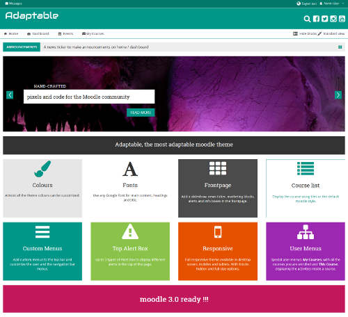
Updated in February, 2021. Gareth Barnard has released “Adaptable” for the latest Moodle releases, 3.8 to 3.10.
Adaptable theme for #Moodle 3.8 and 3.9 updated -> https://t.co/9x25S3zdDz @_elearningworld @lmspulse @moodlethemes @moodledev @moodleplugins @moodle #Adaptable3 @adaptable_theme
— Gareth J Barnard (@gjbarnard) February 9, 2021
A couple fixes and internal tweaks make of “Adaptable” a top-ranking, dependable Free Moodle Theme. Learn all here.
Original post:
A new theme “Adaptable” has been released to the Moodle.Org plugins directory, well almost new, it is actually a fork of the popular BCU theme.
One of the interesting things about Adaptable is it arose from a collaboration between Coventry University (UK) and 3bits Elearning Solutions who were both working on extended versions of the original BCU theme. This means Adaptable offers the kind of layout / branding options desired by E-Learning / training companies whilst also offering features of use to larger organisations particularly around audience targeting and communication.
So, how does Adaptable compare to BCU? Well Adaptable contains all of the features found in BCU and adds many more:
Configurable Fonts, Colours, Buttons and Blocks
If we look at the most popular themes on any platform, particularly WordPress they are all highly configurable. It is no accident that Essential is the most popular Moodle theme, it was the first (to my knowledge) to offer configuration via an admin interface.
When we look at some sites running BCU they are not as nice as they could be as not all administrators know how to add custom.css entries. Thus everything that can be is configurable via the admin interface in Adaptable.
There is a price to pay for this, a LOT of settings which maybe off-putting, the pay off is anyone, with a little time to experiment should be able to setup a nice looking Moodle site without needing to override the css.
Audience targeting
Within adaptable it is possible to target menus, notices, alerts and analytics to custom profile fields (groups will be added in the near future). This means if you are able to update custom profiles with a script to identify staff vs students, department or faculty you can begin targeting link menus and notices to specific groups of user. (I believe Totara may offer similar features).
Persistent Dismissible Bootstrap Alerts
A useful feature of BCU theme was the ability to add a sitewide banner in the header to notify users of important events such as planned downtime / maintenance, a feature commented on by David Mudrák when that theme was originally released. Anyone who has managed a large Moodle site will know the value of this feature.
Adaptable builds on this adding Bootstrap styling allowing different alert types / icons. It also allows administrators to define the number of alerts they wish to add, again allowing audience targeting. For example you could add three alerts targeting each at a different user group, with a different style.
Perhaps the nicest feature is that alerts can be dismissed. Bootstrap has this feature built-in and other themes have already implemented it. The problem was this did not persist, when you reloaded the page the alert returned. With help from Justin Hunt (of PooDLL.com) Adaptable adds an additional Ajax call to update the user preferences, thus once an alert has been dismissed it wont re-appear.

To manage this the administrator sets a “key” which can be any value, though using a date makes most sense. If the key is subsequently changed the alert will re-appear allowing the alert to be re-used with a different message at a later point.

This improves user experience but also makes alerts more useful for administrators as they are not under any pressure to prematurely remove an alert, they can leave it there indefinitely knowing users who have read it can remove it.
Announcements / News Ticker
jQuery sliders are popular particularly with smaller commercial providers and Adaptable includes two different styles of slider. On larger University sites sliders are not popular and can generate complaints. Students who spend hours each week using Moodle do not want to have to scroll down past the same slider each day!
Thus a smaller news ticker has been added which consumes little space and can be shown both on the homepage and dashboard (formerly My Home) pages:

Audience targeting is also possible in news tickers. Administrators can define the number of fields they wish to use, each targeted at a different user group and all notices relevant to a given user will be presented.
One limitation at the moment is it is not possible to order alerts, in future it would be good to add a means to date stamp and subsequently sort entries.
Audience Targeted Analytics
Another area audience targeting has been implemented is in the analytics page. It is possible to add multiple Google Analytics ID’s targeting different user groups (faculty, department being the obvious scenario). In addition it is possible to add one code that appears for all users. Thus it is possible to gather stats for the entire site alongside those for specific user groups.
By using this feature it is possible to gain some very high level and easily understood metrics such as the average time on site between different schools, faculties or departments.
More Marketing Blocks
Adaptable has Twelve marketing blocks on the front page however as these use a Bootstrap grid blocks will scale and interesting layouts can be achieved by reducing the number of blocks used on a given row i.e. leaving some blocks empty in a row of four.
Take the following screen shot as an example, marketing blocks 1-9 are populated but blocks 10 – 12 are empty leaving block 9 “Moodle 3.0 ready!!!” as full width block on that row:

If we now remove block 8 then we see the second row scale to three blocks:

Given this is the case it may make sense to allow the number of rows to be user definable in the future.
User Preferences via Custom Profile Fields
When discussing audience targeting above we are really talking about using locked custom profile fields, however it is possible to add a drop down list to a users profile which is configurable by them (the user) to control where menus appear:
- sitewide
- home pages only
- disabled
This was a response to some users complaining that the header was too busy, and worse that top menus can interfere with assistive technologies for partially sighted students. It is planned to extend this feature to cover social icons and other elements students may not want to appear on course pages.
Configurable “Social Icons”
It is possible to configure social icons in Adaptable using a de-limited text field along the lines of a Moodle Custom Menu. This allows icons to be used for anything the administrator wants, links to web mail or other in-house systems for example.

As social icons replace the search box (if enabled) another trick is to add a “social icon” using a search icon to provide a sitewide link back to Moodles course search.
![]()
Mobile Settings
One of the nice features of Essential was the ability to customise the way the site looks on Mobile and this thinking has been copied over to Adaptable allowing administrators to disable logos, headings and social icons, or control the way they display. There is some work to be done on this but it does make a difference having some control over this.
Summary
We hope people like Adaptable and that it attracts users and the ideas they bring with them. More than that it would be nice to see some of the ideas implemented in Adaptable propagate to other themes.
There is no documentation for Adaptable currently but this will start to appear on Moodle Docs shortly.


One Response
Adaptable looks to be a great theme, and Essential is certainly the most popular and is highly configurable too, but “it
was the first (to my knowledge) to offer configuration via an admin
interface.” isn’t correct – there were many themes prior to Essential that had theme settings pages for configuration through the admin interface, back as far as the early days of Moodle2 (flexi_ii was available for 2.0 and that wasn’t the first even then).
That doesn’t take anything away from the innovation of both themes (and others) or the way that configuration has moved on since then! And hopefully will continue to move on for the benefit of the users.
Thanks for another great review of Moodle plugins, Joseph 🙂