Updated in June 2022. Updates to Moodle™ Visual customization coverage come courtesy of Edwiser.
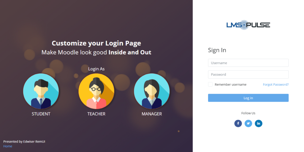
With this article, you are going to learn how to manage and customize your Moodle™ login page.
In this guide:
Depending on the design of your site, a login page can affect your user interactions. First-time would do well getting a taste of what awaits them across the login gate, in both form and content. Recurrent users could find value in good design as well. But for them, making the actual login quick and painless is on top of their list.
No matter your use case scenario, the following guide will set you up. We begin with an inventory of assets and things you need to keep at hand. Then we dive into the customization options Moodle™ has available.
Let’s dive in!
Login page inventory: Needs and wants
You can choose a login page that focus on an efficient way to access a Moodle™ site. Or you can make an engaging, sensory-rich page that reflects your learning experience. Most sites stay within the extremes. If all you care about is speed, there is nothing wrong with a nice, light image next to it. You could also take advantage of a login page as a branding opportunity, where form and function are a reflection of your values.
To go on, let’s break down the “assets” you will need to have available. First, think about the mandatory functional assets:
- A username field
- A password field
- A Login button
- A “Remember username” checkbox
- A “Forgot password” link
There are also “semi-mandatory” assets, which depend on the kind of Moodle™ site you are running and your business case.
- A “Create new account” button. (Note that enabling this is not as easy as you would hope.)
- “Sign up using” buttons that let users log in using their credentials on Google, Facebook or other platforms to authenticate using the OAuth 2 protocol.
- “Login as guest” button, in case you want to demo part of your experience to the public.
Now, the “optional” features. I put them in quotes because, while their absence will not affect the functionality, not having them would be a missed opportunity to promote your organization’s identity and values.
- Your logo
- Background images
- “Lead” content: Short copy, images or videos placed prominently on the page
- A style sheet including your color palette, custom fonts and general design patterns, in the form of CSS or SCSS files
- Instructional or marketing copy. Sometimes, the same content can serve both purposes
- A language button, in case you are serving multiple languages.
Authentication methods and your login page
In Moodle™, the “username + password” method for users to log into their platforms is hardly the only one. The open LMS is compatible with several options, often using third-party providers. Some of the extensions are built-in, others are available through plugins. The method availability determines some of the icons on your site’s login page.
Some methods override Moodle™’s common ones, and add buttons to the login page. The CAS (Central Authentication Service) method, for instance, effectively makes a Moodle™ login page unnecessary.
“Log in as a guest” is an interesting example, and perhaps one too often overlooked for its potential. It allows access to courses that allow it, and it limits the interactions. (It is a read-only role, after all.)
Since Moodle™ 3.3, a site can enable third-party authentication without the need of plugins. This is possible thanks to OAuth2 compatibility. OAuth2 or “social login” is a widely adopted specification that connects login information. It keeps data secure and private. When you click on “Log in using Google” or any other service, Moodle™ gets basic profile information. It never gets your full password. It is often considered a more secure and practical option to manual login. You can add as many buttons as you want, from the over 30 platforms compatible with “social login.”
Most modern LMS support OAuth2, including Instructure Canvas, Blackboard, and Brightspace.
Back to TopThemes or CSS: What are my login page design routes?
It is a widespread opinion that a Moodle™ theme is the path of choice for any visual editing on your site. The Moodle™ Docs imply it. In fact, think of default “Boost” theme as the basis for your custom development, be it a preset or a full-blown theme.
Editing a Moodle™ login page using a theme
This route has the downside of limiting you to a few layout and options. That, in case the theme actually gives you login page editing capabilities. This means the process depends squarely on the theme’s settings page.
It also means figuring out which theme lets you tweak your login page is not straightforward. We know that the free “Fordson,” “Adaptable” and “Moove” themes, as well as premium “Edwiser RemUI,” offer some degree of login page customization.
When it comes to dashing, if not very editable, login pages, the brand new “Trema” theme is worth mentioning. Animated particles populate the screen in a mesmerizing way. See it in action.
If you are happy with your theme, but it does not provide a settings page, your best bet could be to go to the code. Godspeed!
Editing the Moodle™ login page files directly (Advanced)
To edit the code of your login page, you should have experience with HTML, CSS and SCSS editing. Some familiarity with PHP and JavaScript syntax can also come in handy.
If you have worked with CSS before (and if you are reading this it’s because you are), you are aware of these safety checks:
- In line with the official recommendation, edit or build your login page within the context of a custom theme.
- Work on a local or test version of your Moodle™ site, never on production site directly.
- Set up GitLab, GitHub or a similar version control tool, to keep track of your changes, be able to reverse course if necessary; send to production, and enable auditing and collaboration down the line if necessary.
If you don’t have the experience, fear not. We are not discouraging you from tweaking your Moodle™. The opposite is true. We have stressed before how CSS is an ideal introduction into programming syntax for educators. Furthermore, Moodle™ offers some advice on creating your own custom theme from the ground up.
The sweet spot: Pick a theme with CSS editing tools
Fortunately for you, there is a broad variety of themes who offer the best of both worlds. They provide a delightful design that you can still make your own thanks to CSS editing. You can find plenty of great Moodle™ themes, both free and premium, on the Moodle™ Plugin Directory.
Free Moodle™ themes give you a modern look and feel. But for those looking to take their branding an experience to the next level, premium themes like Edwiser RemUI can be what you have been looking for. Not only it includes dozens of layouts for you to play around and switch with ease, it anticipates your needs by adding new features and bundling other plugins.
Back to TopR&R
- Moodle™ Docs — Developer documentation on theme customization
- Get Edwiser RemUI
- Share a customization hack with us!
Disclaimer: eLearn Magazine is part of Open LMS. Plugin mentions on this website should not be seen as endorsements by Open LMS or any team members. Please look into Moodle™ plugins carefully before implementing them into production. Connect with the eLearning Community to learn about availability of plugins and features in Open LMS systems.


